Attempts at Distribution Plot with pyplot and Plotly
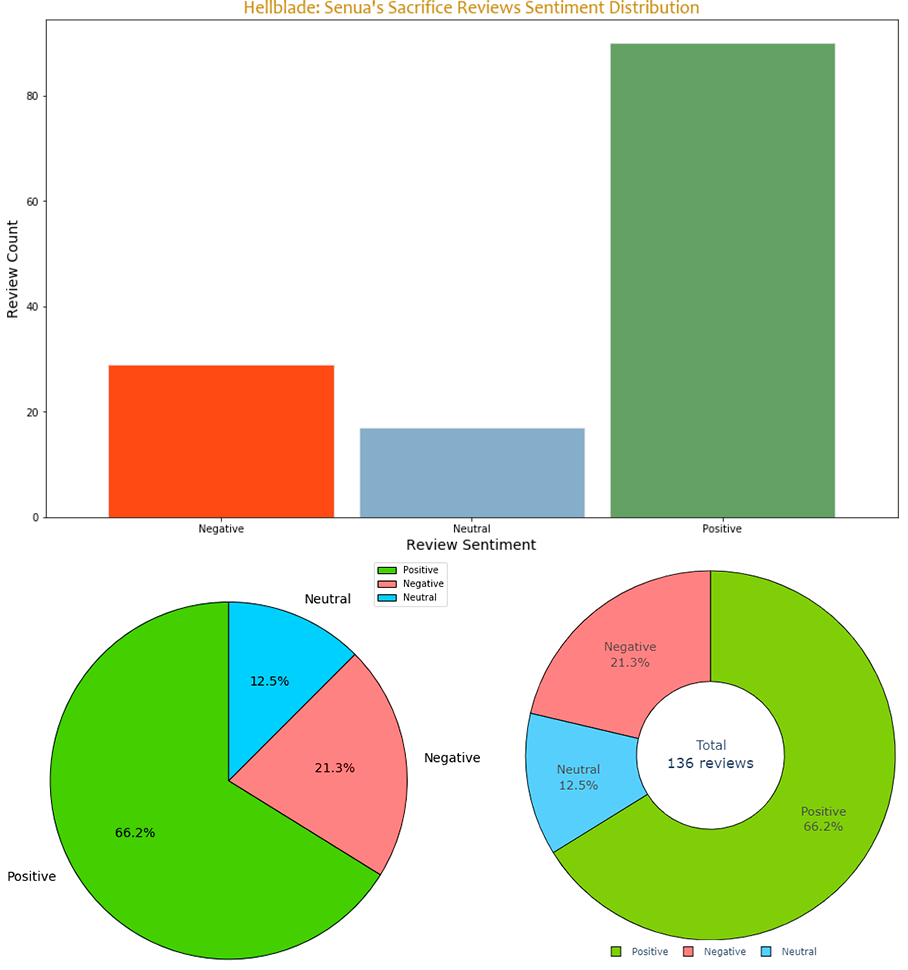
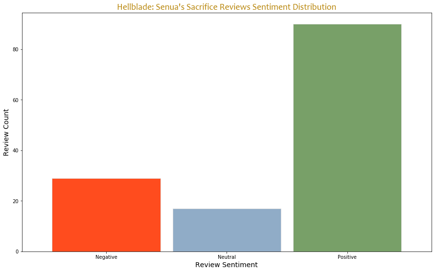
Several ideas crossed my mind while I was trying to visualize the sentiment distribution for the sentiment analysis obtained as the output of my model. At first I made the bar chart, but it doesn’t really reflect the data as a whole, I would rather use it in case of at least 4 segments.
Then I thought that I could use a pie chart and I encountered a new problem where I couldn’t configure the start angle as the largest slice of a pie should mostly cover the right part, but when it does, it displays it on the left. However, this is already a better solution than the bar chart.
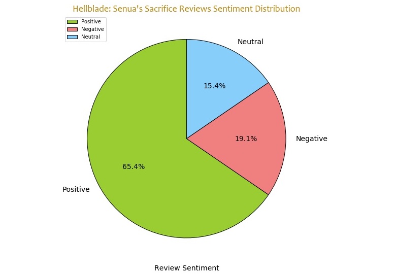 Whenever I tried to set the right angle, it was messing the order and showing information similarly to the following plot.
So I remembered Plotly… and it isn’t perfect, as I couldn’t find the way to set the right order to display slices. It should follow the clockwise order in which the slices go smaller in a perfect world, below is what we get in the real one but it’s interactive, and more informative because of it, even if it looks very similar in the static state, one can find the numbers behind it, so here’s that.
I may want to try to visualize it later on or make an attempt to fix Plotly pie chart.
Here’s an interesting thing, I was surprised to see that the numbers in Plotly’s interactive chart were different to pyplot, so I decided to rerun my code and now the numbers correspond but they are different in two different posts (and the highlighted image of this post). It must be related to the fact that Google Translate is evolving and the newly added changes have affected the translation, cause the reviews were machine translated and then sent to VADER, so the results may actually get better if they don’t get worse. Hehe.